
 The Born Beautiful Campaign
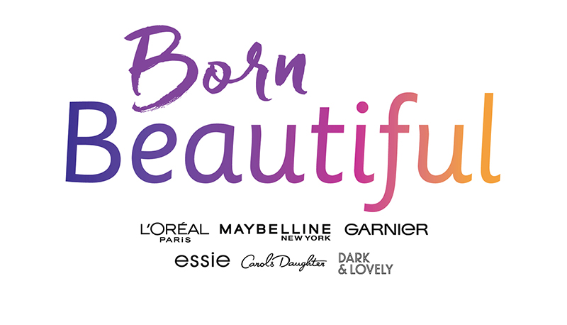
For our account CVS I was briefed along with a colleague to design a Logo and campaign centered on diversity that features all consumer product brands of L’Oréal. I started with designing the Logo containing two words and decided for the word “Born” to have a more natural and spontaneous feel, hence the script font Freeland and for the word “Beautiful” I chose the more stylized and well balanced font Sassoon Primary to uncover the duality of being born rather randomly—and then choosing individually to form ourselves and personalities more consciously during our lives. The coloring supports this story and starts with a solid color and develops into a gradient of different tones. I then continued to develop the hero visual based of a terrazzo stone background and arranging the different L’Oréal products on top of it, tied together like an accordion to create an unmistakable and consistent look & feel. Since each model at L’Oréal is associated to a specific product, the challenge was not to use any. This visual also needed to work and be applicable on various communication tools such as an Instagram posts or stories, trade ads, as email blast and banner on the CVS website. See her for the presentation.
for more work please visit the space Branding